

Theme tokens
Theme tokens are site-wide design variables. Changing a token updates every component that uses it, so you do not need to restyle individual blocks.
Open the theme panel
Section titled “Open the theme panel”- Click Settings in the topbar.
- Click Theme in the dropdown menu.
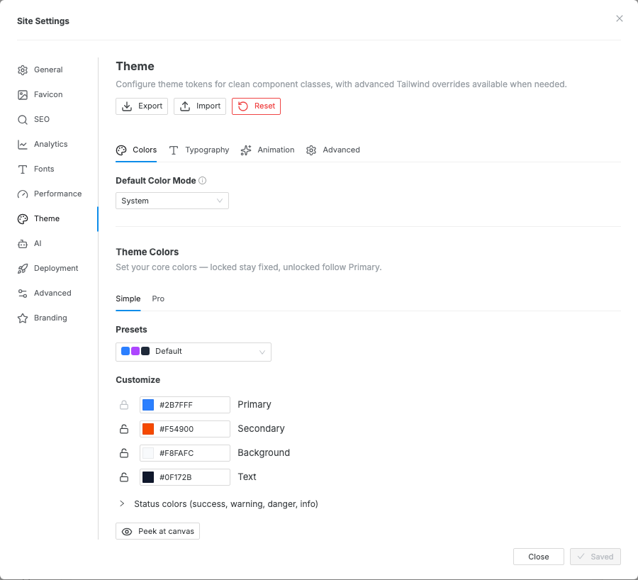
- The Site Settings modal opens to the theme editor, which has four tabs: Colors, Typography, Animation, and Advanced.
Colors
Section titled “Colors”The Colors tab starts with Default Color Mode, then separates color work into Simple and Pro tabs.
- Default Color Mode sets whether the site loads in System, Light, or Dark mode.
- Simple is the recommended workflow. Edit the eight core color roles and Swebsy generates a coherent light and dark theme from them.
- Pro exposes the generated light mode colors, dark mode colors, and Base Colors palette for exact token overrides.
Generate theme colors
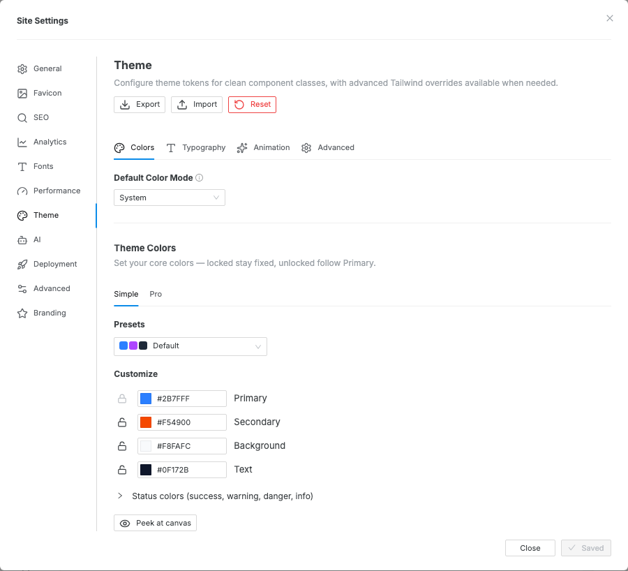
Section titled “Generate theme colors”Simple has two sections — Presets and Customize. The quickest start is a preset palette: pick one from the Presets dropdown and Swebsy fills the core colors, then regenerates a coherent light and dark theme you can tweak below. Default returns to the stock theme every new site ships with, and the dropdown reads Custom once you hand-tune any core color.
Under Customize, Simple shows four core color roles up front, with the rest under a Status colors reveal:
| Role | What it drives |
|---|---|
| Primary | The main brand color and the generation anchor. |
| Secondary | Supporting brand color. |
| Background | The base page surface. |
| Text | Default readable text. |
| Status | Success, Warning, Danger, and Info (under the reveal). |
Editing any color updates the generated theme live on the canvas and marks the settings modal as unsaved. Click Save in the modal footer to keep the generated theme, or Discard / close the modal to abandon it. When your text and background colors are readable, Simple confirms it; otherwise it flags the pair that falls short of the WCAG AA contrast standard.
Each row has a lock:
- Editing a color locks it, so the generator keeps it exactly as you set it.
- Unlocked colors follow Primary — they regenerate whenever the theme recalculates. Click the lock to toggle; Primary is always locked because it anchors the palette.
Use Peek at canvas when the modal blocks the area you want to inspect. The modal hides temporarily so you can review the live preview before saving or discarding the settings.

Refine colors in Pro
Section titled “Refine colors in Pro”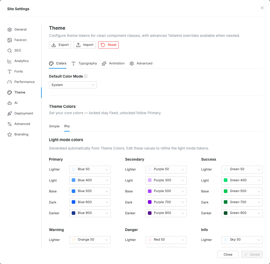
Use Pro when the generated theme is close but needs exact control. The Pro tab contains:
- Light mode colors — semantic token mappings for the light theme.
- Dark mode colors — generated semantic token mappings for the dark theme.
- Base Colors — the underlying Tailwind-style palette that theme colors reference.
Simple and Pro edit the same theme tokens. If you edit colors in Pro and then switch back to Simple, Swebsy warns that Simple can regenerate and overwrite those Pro edits.
You can also open this panel directly from any Design color field: click the gear in the lower-left corner of the swatch picker.
Typography
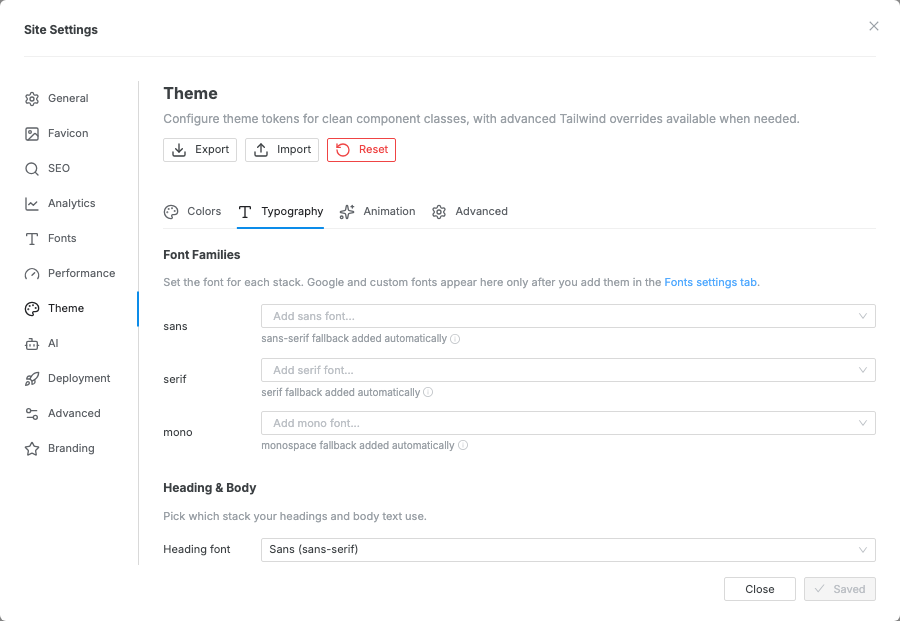
Section titled “Typography”The Typography tab controls:
| Setting | What it controls |
|---|---|
| Font family (sans / serif / mono) | Base font for body text, headings, and code |
| Font size scale (xs → 9xl) | The responsive type scale used by all text components |
| Font weights | Available weight steps (light → bold) |
| Line height | Tight / normal / relaxed variants |
To use a custom or Google Font, add it in Settings → Fonts first, then select it here.
Animation
Section titled “Animation”Site-wide animation defaults. See the Animation guide for details.
For element-level dark-mode overrides and the visitor-facing dark/light switch, see the Dark mode guide.
Advanced
Section titled “Advanced”The Advanced tab is a Custom CSS editor. Paste raw CSS to extend or
override anything the UI panels above can’t reach — restyle a whole component
type, add a custom shadow, or target a class across every page. It is compiled
into your site’s stylesheet, so a rule like .btn { … } applies site-wide to
every current and future button. Custom CSS wins over built-in styles on
conflicts.
Available variables
Section titled “Available variables”Reference these theme variables in your custom CSS with var(--name) so your
styles track the theme and stay dark-mode aware (never hardcode a hex):
| Group | Variables |
|---|---|
| Brand colors | --color-primary, --color-secondary, --color-success, --color-warning, --color-danger, --color-info — each with -lighter / -light / -dark / -darker ramps |
| Surface & text | --background-color-default / -subtle / -muted, --text-color-default / -muted, --border-color-default / -subtle / -muted / -highlight / -emphasis |
| Neutral | --color-neutral (the dark neutral fill behind tooltips, alerts and neutral buttons), --color-inverse (the readable ink on a saturated fill — it flips with the mode) |
| Base palette | --color-{family}-{shade}, e.g. --color-slate-950, --color-pink-500 |
| Typography | --font-sans / --font-serif / --font-mono, --text-{size} (xs → 9xl), --font-weight-{step}, --leading-{name} |
Component styles read their own variables too — for example the button honors
--btn-border-color, --btn-border-width, and --btn-border-radius, so
overriding those in a .btn { … } rule restyles every button at once.
Color change appears on the canvas but is lost later — Simple mode previews changes live, but the settings modal still owns the final save/discard step. Click Save to persist the generated theme.
Pro edits changed after returning to Simple — Simple mode regenerates theme colors from the color table. Lock rows in Simple for colors that must be preserved, or stay in Pro for fully manual token mapping.
Custom font not available in the font family picker — add the font via Settings → Fonts first, then reopen Settings → Theme and select it in the Typography tab.