

Design panel
The Design tab in the right sidebar is where you style the selected canvas element. Its controls are grouped into six sections named for the design decision they hold — Layout, Size, Spacing, Type, Fill, and Effects — with utility classes and raw CSS under Advanced.
Use Layers first when you need to select an exact Container, Row, Column, Button, Image, or nested child before styling it.
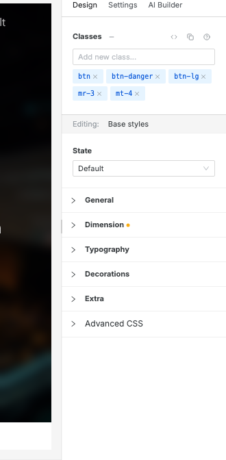
Open the Design panel
Section titled “Open the Design panel”- Select an element on the canvas or from the Layers tab.
- Open the Design tab in the right sidebar.
Check the Screen, Mode, and State rows at the top of the panel.
- Adjust the style controls for the selected element.
If nothing is selected, the Design panel shows an empty state. Select an element first.
Find a control
Section titled “Find a control”Each section collapses to its name. A gold dot beside the name means the selected element already has a value set in that section.
| Section | What it holds |
|---|---|
| Layout | Display, the flex or grid controls, position and its offsets, and float. |
| Size | Width and height, with their minimum and maximum. |
| Spacing | Margin and padding, for all sides at once or one side at a time. |
| Type | Font family, size, weight, letter spacing, color, line height, alignment, and text shadow. |
| Fill | The background: a solid color plus gradient, pattern, or image layers. |
| Effects | Border radius, border, box shadow, clip shape, opacity, transition, and transform. |
Layout
Section titled “Layout”Display has four buttons: Block, Flex, Grid, and Hidden. The select beside its label holds the rest, such as Inline-flex or Inline-grid.
The rows below follow the choice. Flex shows direction, wrap, gap, and alignment; Grid shows columns, gap, and alignment. Inline-flex and inline-grid get the same rows. A value already set always stays visible, so you can read or clear it.
Under them sit Position and, for a positioned element, its offsets. When the element’s parent is flex or grid, an As a flex item or As a grid item group follows, for how the element sizes, spans, and aligns inside it. Float is always last.
Choose colors
Section titled “Choose colors”Color fields use one shared swatch picker across Design properties, gradient stops, and pattern colors. Open a color field, then choose between:
- Theme — semantic colors arranged in predictable pairs: Primary and Secondary, Info and Warning, Success and Danger, Background and Text, then Border and Neutral. Each family runs from lighter to darker; Neutral holds the two standalone roles, Neutral and Inverse.
- Palette — exact shades grouped by hue, with the full 50–950 scale kept on one row.
Type in the color field to search both tabs at once. Hover a swatch to see its plain-language name, such as Primary Light or Amber 300. The footer keeps the actions available for that field—such as Unset, Transparent, or Custom—separate from the color choices.
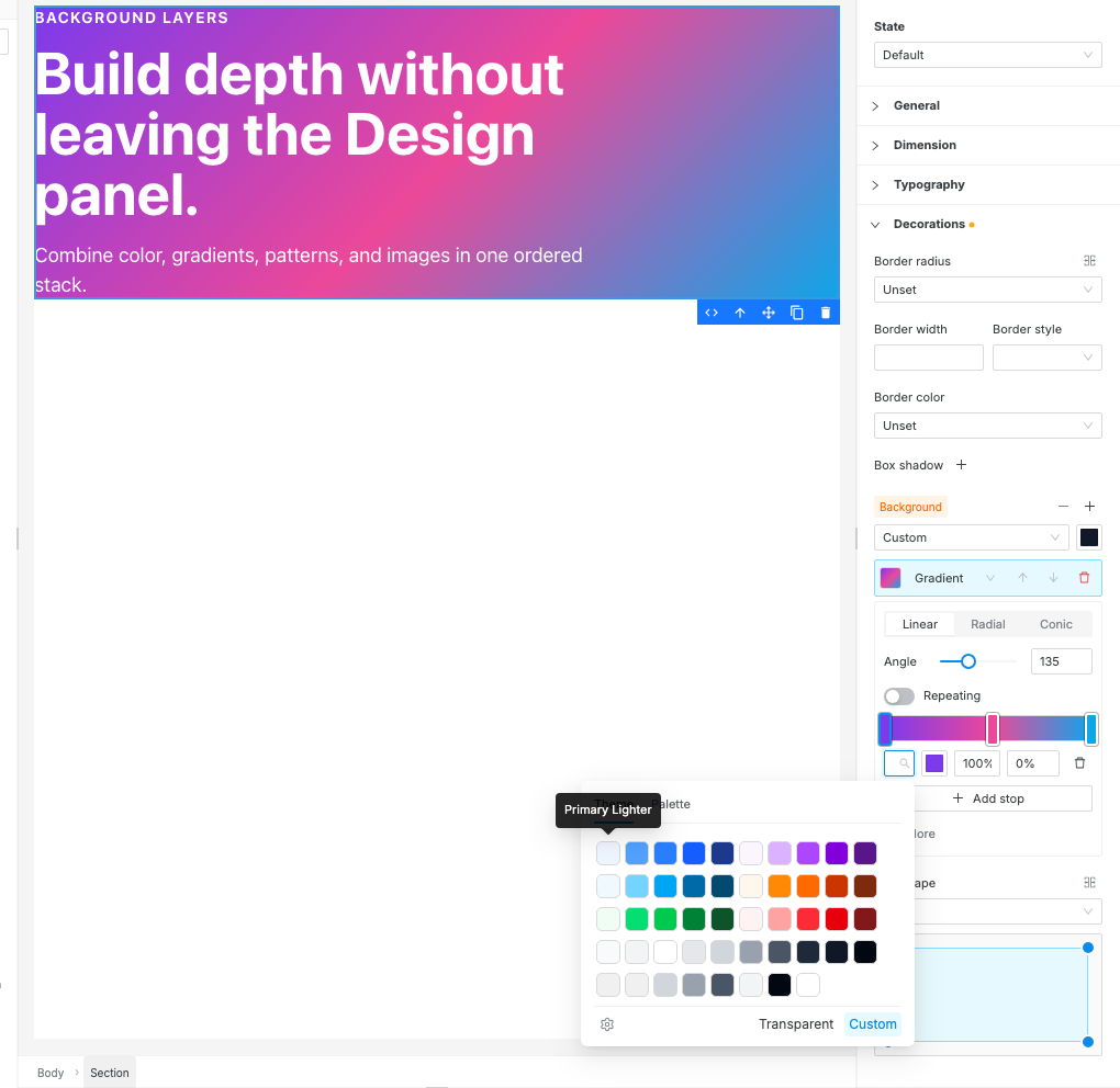
When the site already uses some colors, an In this site row sits above the tabs. It lists up to ten colors from the site’s own styles, custom colors first, so you can reuse a color you typed before.
Use the gear button in the lower-left corner to open Settings → Theme when the palette itself needs to change. Use Custom only for a one-off color that should not follow the site theme.
Understand the Screen, Mode, and State rows
Section titled “Understand the Screen, Mode, and State rows”Three rows at the top of the Design panel say where the next style change will apply. A row is tinted when it narrows where edits land.
| Row | Values | Meaning |
|---|---|---|
| Screen | All sizes or Mobile | The default mobile-first style. Both write it. |
| Screen | Tablet and up, … | A larger breakpoint override. It applies from that size upward. |
| Mode | Light or Dark | Dark writes a dark-mode override for supported properties. Light edits are inherited by dark. |
| State | Default, Hover, Focus, Active | A state override for interactive states. |
Screen and Mode match the screen-size and Light / Dark controls above the canvas, so changing either place changes both. State applies only to the selected element.
Contexts can combine. For example, editing while Dark and Laptop are active can create a dark-mode style that only applies from the Laptop breakpoint upward.
Spot values set at other sizes or in dark
Section titled “Spot values set at other sizes or in dark”A field can have its own value at another screen size or in dark mode that you can’t see from where you are. Change a hero’s padding on Desktop, switch to Mobile, and it seems nothing happened, because Mobile has its own padding.
When that’s the case, a small ring sits beside the field’s name (for padding and margin, in the top-right corner of that box). Hover it to see where else the value is set, such as Also set at Mobile; Dark. For padding and margin it gives the values for each side too.
Click the ring to jump there: the canvas switches to that size or mode, and the whole Design panel follows. When the value is set in more than one place, the click opens a short list to pick from.
The ring only points at places you can’t see now. When the value on screen already comes from another size or mode, the field’s tinted name says so instead.
Responsive design edits
Section titled “Responsive design edits”Swebsy is mobile-first:
- Start in All sizes or Mobile and make the base layout work.
- Switch to a larger device with the device icons above the canvas.
- Change only the styles that need to differ at that larger size.
For example, set comfortable mobile padding in Mobile, then switch to Laptop and increase section padding or change a column layout.
Read the full workflow in Responsive editing.
Dark-mode design edits
Section titled “Dark-mode design edits”Use the Light / Dark switch above the canvas, beside the device icons, or View → Preview Dark Mode, to switch the canvas into dark preview mode. When the Design panel shows Dark, supported style changes are saved as dark-mode overrides.
Dark-mode overrides are most useful for:
- text color
- background color
- border color
- shadow
Spacing and layout usually stay shared between light and dark mode. Use the full Dark mode guide when you need to style a dark version of a page or add a visitor-facing dark/light switch.
State edits
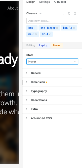
Section titled “State edits”Use the State selector to style interactive states:
- Hover — when a pointer is over the element.
- Focus — when the element receives keyboard focus.
- Active — while the element is being activated.
Use state edits for buttons, links, cards, and other interactive components. Return the selector to Default before continuing normal styling.
Fill and effects
Section titled “Fill and effects”Open Fill to paint the selected element’s surface. Background combines a solid color with ordered Gradient, Pattern, or Image layers. When a section’s look comes from a photo or a dark overlay placed behind its content, those show at the top of Background too, so you can recolor, replace, select or remove them. See the complete Backgrounds guide.
Open Effects to shape that surface:
- Border Radius rounds corners. Use the split-cells icon to open advanced corner controls.
- Border sets the width, style, and color of the outline.
- Box Shadow adds one or more shadow layers.
- Clip Shape trims the element into a visual shape, such as a slanted or skewed background.
- Opacity, Transition, and Transform fade, animate, or move the whole element.
Use Clip Shape when you want a section, card, or banner background to have a custom silhouette without writing CSS. Choose a preset from the dropdown, then drag the handles in the preview to adjust the polygon.
For precise edits, click the advanced point-control icon beside Clip Shape. This opens the X/Y percentage values for each polygon point. The point controls are advanced because they are the exact values generated by dragging the preview handles.
Classes and utility mode
Section titled “Classes and utility mode”The Classes area lives inside Advanced, at the bottom of the Design panel, above the element’s CSS. It shows the classes applied to the selected element. You can:
- add utility classes from suggestions
- remove individual class chips
- copy all classes
- switch to text mode to paste or edit space-separated classes
- open Tailwind help from the question icon
Use utility classes when a visual adjustment is not exposed as a form control. For common styling, prefer the visible Design controls first so the selected context stays obvious.
Clear an override
Section titled “Clear an override”Most modified controls show a clear action. Clearing a value removes the style for the active context.
For example:
- Clearing a Laptop font size removes the Laptop override and lets the value inherit from smaller breakpoints.
- Clearing a Dark color removes the dark override and lets the light/base color apply.
- Clearing a Hover value removes only the hover-state style.
I changed desktop but mobile changed too — you were probably editing All sizes. Switch to the larger device first, then make the override.
I changed a value but another size or dark mode didn’t follow — that size or mode has its own value. Look for the small ring beside the field’s name and click it to go there.
I changed a style but the wrong element updated — select the exact layer in the Layers panel before using Design controls.
Dark-mode edits changed the normal page — confirm the canvas is in dark preview mode and the Design panel’s Mode row shows Dark before changing colors.
Hover styles keep applying to later edits — set State back to Default after styling the hover/focus/active state.