Editing tips
Use these tips when you know what you want to build, but are not sure which part of Swebsy to use. The best workflow is usually the one that keeps repeated work reusable, one-off work simple, and style changes easy to understand later.
Choose the right tool
Section titled “Choose the right tool”| Use this | When it fits best | Example |
|---|---|---|
| Blocks | You need a full section as a starting point. | Add a hero, CTA, testimonial row, gallery, or footer layout, then edit it. |
| Components | You need one piece of content or layout. | Add a Button, Image, Card, Row, Column, Embed, or Icon. |
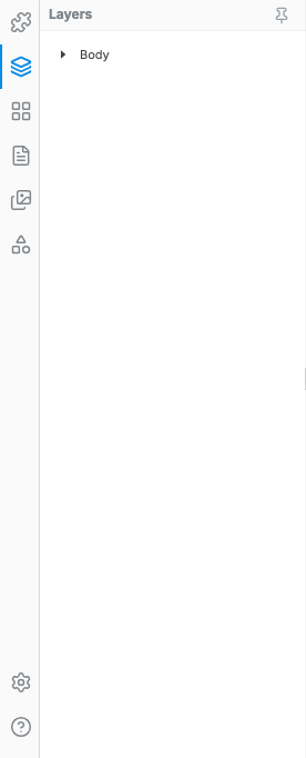
| Layers | You need to select the exact nested element. | Select the card wrapper instead of the text inside the card. |
| Design panel | You need to change spacing, layout, color, border, shadow, shape, or classes. | Add padding to a section, round a card, or create a slanted background with Clip Shape. |
| Theme tokens | You need a site-wide visual decision. | Change the primary color or default font across the project. |
| Symbols | You need repeated content that should stay synced. | Reuse the same footer, custom card, pricing card, or CTA strip across pages. |
| Custom code | The visual editor does not expose the thing you need. | Add a third-party widget or custom CSS for a very specific effect. |
When to use Symbols
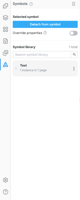
Section titled “When to use Symbols”Use a Symbol when the same element appears in more than one place and you want future edits to update every linked copy. Symbols are strongest when the structure and styling should stay consistent.
Good Symbol candidates:
- Custom cards used across multiple pages, such as service cards, feature cards, case-study cards, profile cards, testimonial cards, or contact cards.
- Custom button patterns that are more than a simple color change, such as an icon button, app-store button, pill CTA, or button with supporting text.
- Navigation and footer pieces, such as a full navbar, footer, repeated footer column, social link row, or reusable nav item group.
- Conversion sections, such as CTA strips, newsletter signups, pricing cards, logo rows, badges, and trust banners.
Avoid Symbols when the element is meant to drift from page to page. A one-off hero, page-specific content section, temporary experiment, or layout that will be heavily customized is usually better as normal components or a Block.
Practical examples
Section titled “Practical examples”| Goal | Best workflow |
|---|---|
| Build three cards for one pricing section. | Use Card or Card Group components, then duplicate the cards inside that section. |
| Reuse the same pricing card on the home page and pricing page. | Create a Symbol from the finished card, then insert Symbol instances. |
| Keep the same footer on every page. | Create one footer Symbol and insert it on each page. |
| Make one footer link label different on one page. | Use a Symbol instance override for that small local change. |
| Make a one-off landing page hero. | Start from a Block or normal Components, not a Symbol. |
| Add a shared background around text, images, and buttons. | Select or create a wrapper, then style the wrapper in the Design panel. |
| Make a slanted section background. | Select the section or wrapper, then use Design -> Decorations -> Clip Shape. |
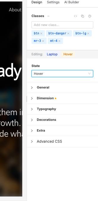
| Style a hover effect on a button or card. | Select the element, choose Hover in the Design panel State selector, edit the style, then return to Default. |
Select before styling
Section titled “Select before styling”Most confusing edits come from styling the wrong hierarchy level. Before making layout or visual changes, confirm what is selected:
- Style a Section, Container, Div, Card, Row, or Column when you want shared spacing, background, borders, shadows, clipping, or layout behavior.
- Style a Heading, Paragraph, Button, Image, Icon, or Link when you want the content element itself to change.
- Use Layers or the canvas breadcrumb when clicking on the canvas selects the wrong nested element.
- Rename important wrappers in Layers, such as
Pricing card group,Footer links column, orHero CTA row, so future edits are easier.
If you need a background, border, padding, shadow, or clip shape around several pieces of content, create or select a wrapper and style that wrapper. Styling each child separately usually creates more work and is harder to maintain.
Style in the most maintainable place
Section titled “Style in the most maintainable place”Prefer the most visible, reusable control that solves the problem:
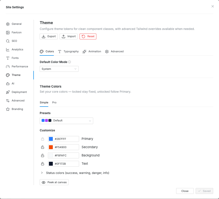
- Use Theme tokens for site-wide colors, fonts, and defaults.
- Use the Design panel for element-level spacing, layout, typography, color, borders, shadows, and clip shapes.
- Use utility classes when a style is not exposed as a visual control.
- Use Advanced CSS or Custom code only for effects that the editor cannot represent directly.
For example, do not manually set the same brand color on ten buttons if it is really the site’s primary color. Set the primary token once, then let the buttons inherit the shared decision.
Responsive and state habits
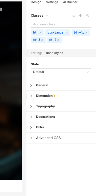
Section titled “Responsive and state habits”Swebsy’s responsive styles are mobile-first. Make the base/mobile version work first, then switch to Tablet, Laptop, or Desktop and change only what needs to be different at that size.
Use state edits only while you are working on the state:
- Use Hover for pointer hover effects on buttons, links, and cards.
- Use Focus for keyboard focus visibility.
- Use Active for the pressed or activated state.
- Return the State selector to Default before continuing normal styling.
For dark mode, switch the canvas into dark preview mode and confirm the Design panel shows the Dark editing context before changing dark-mode colors.